The NASA Earth Observatory has a nice graph to show average global surface temperatures.

I noticed a small anomaly with the 2010 figures. The blue line, for the British Hadley Centre, appears to be missing.

You can check this by downloading the HADCRUT3 data set from here. Popping these figures into an Excel graph I get the following.

Excel even defaulted to the correct colour! The 2010 average temperature anolmaly on this data set is .468, as against .474 in 2005 and .529 in 1998. This is significant in that the NASA GISS figures show 2010 to be the warmest year on record, something that was pre-announced by leader James Hansen before the year was half way through. Try Googling 2010 Warmest Year on record to see the number of hits. But inclusion of the HADCRUT figures refutes the headline. Statistically it may not be significant, but the headlines show that politically it is important. It is the difference between the claim that global warming stopped in 1998, and that it is continuing.
There is previous form in the climate community, as Steve McIntyre has noted. McIntyre has the following graphic (at page 28 of McIntyre, S. 2008b. How do we “know” that 1998 was the warmest year of the millennium?. Ohio State University Seminar, may 16, 2008.)
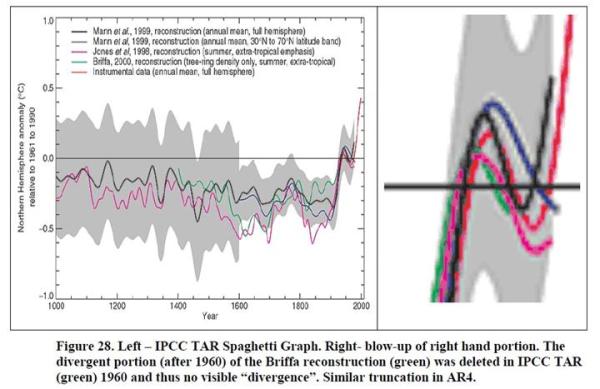
As Steve McIntyre states
“In the IPCC Third Assessment Report, they did worse than simply ignoring the problem.
They deleted the declining portion after 1960, thereby giving a false sense of coherence
between the proxies. In AR4, as a reviewer, I asked them to restore the deleted portion.
They refused saying that showing this information would be “inappropriate” (See
IPCC WG1 chapter 6 29 Review Comments) and the downward late 20th century portion
of the Briffa et al 2001 reconstruction was once again deleted in IPCC AR4.”

1 Comment